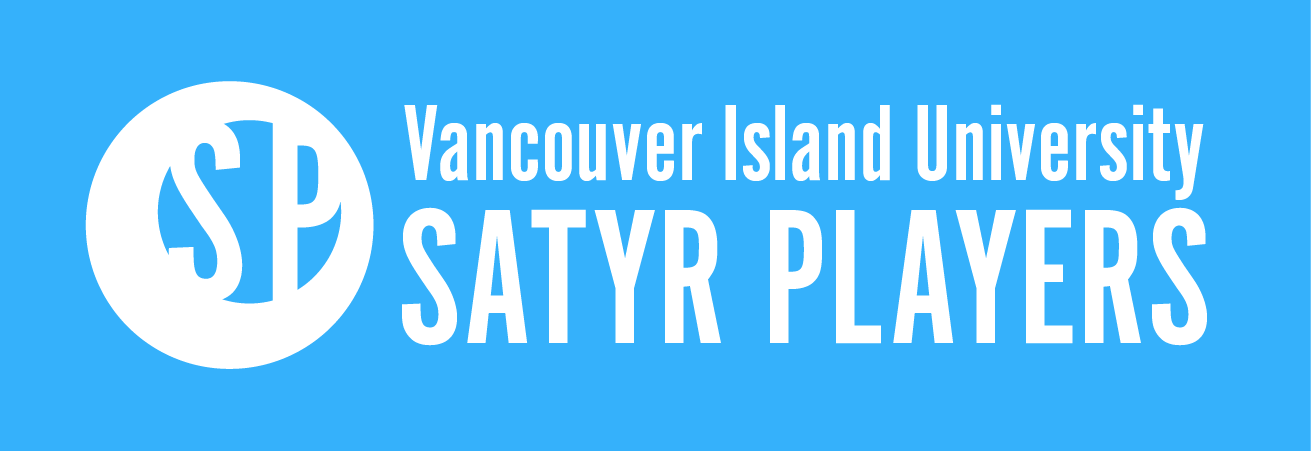
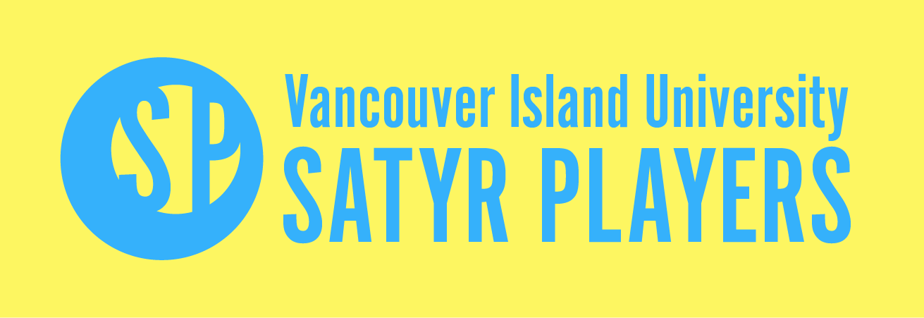
Brand Redesign
Using elements from their previous projects, I've created a new brand identity for the VIU Satyr Players theatre club. Their previous logo was low res, unreadable, and non-scalable. The logo and wordmark is used on posters, banners and social media.
The players put on a variety of shows each semester, so it needed to be versatile enough to fit each one. I researched logos and imagery used by other university organizations and theatre clubs. I chose to make the "Spotlight" logo non-illustrative to allow for the colours and tone to change depending on the project. The standard version of the logo is a bright blue for their energetic island style.
"The posters look fantastic! I'm hopefully going to get a bunch put up around campus these week so then everyone can appreciate how great they look."
-Ariel Pretty, Satyr Players President


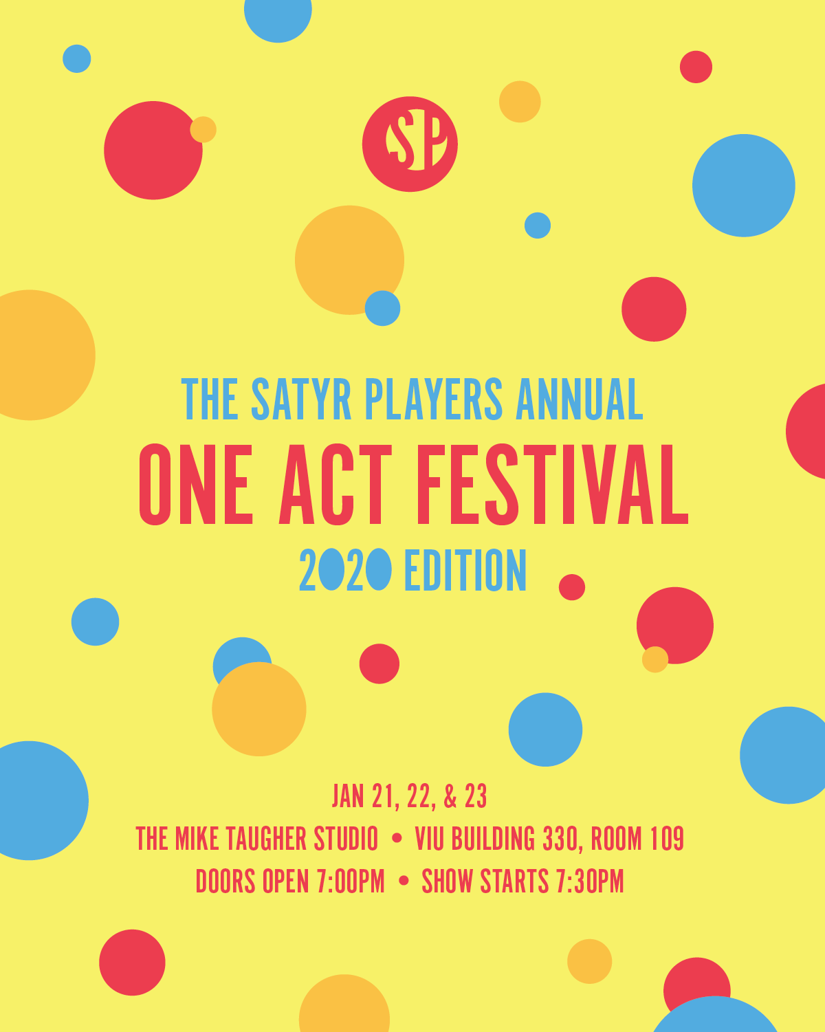
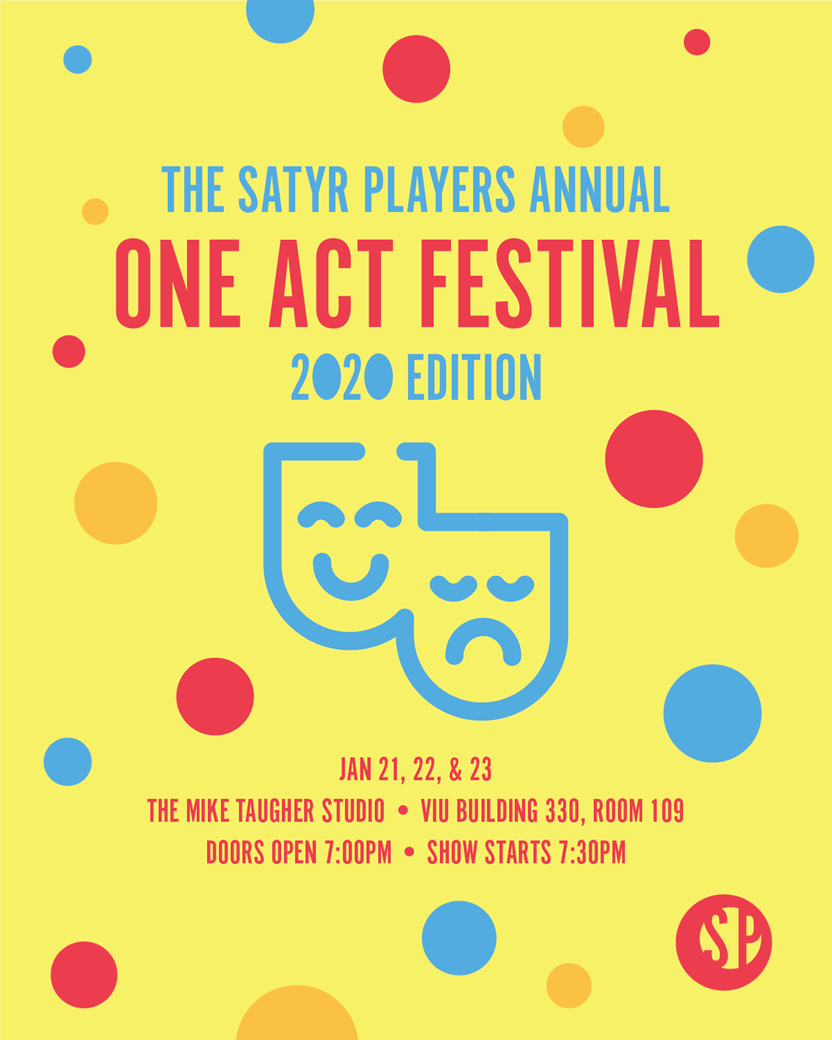
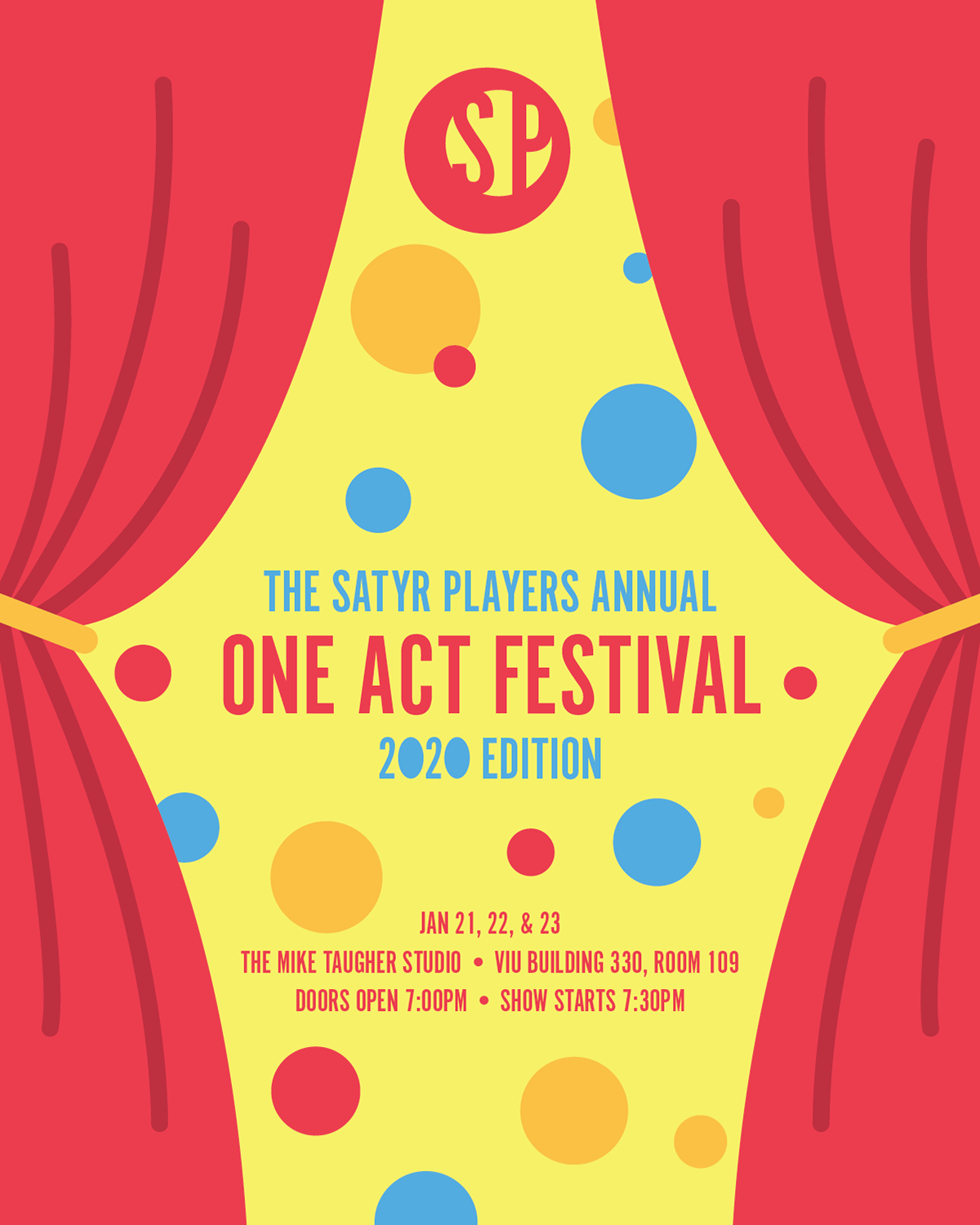
One Act Festival
The One Act Festival was the first use of the new "Spotlight" logo. I used the same colour pallet as the designer chose for the poster the year prior, in which the only graphic element was geometric shapes.
Each version was used on social media or the ticketing agency to promote the event. The group wanted something that would read clearly as "theatre" without having to read the post. I made two alternatives, the masks, based on icons from the noun project, and stage curtains. I also created a banner to display in the lobby for
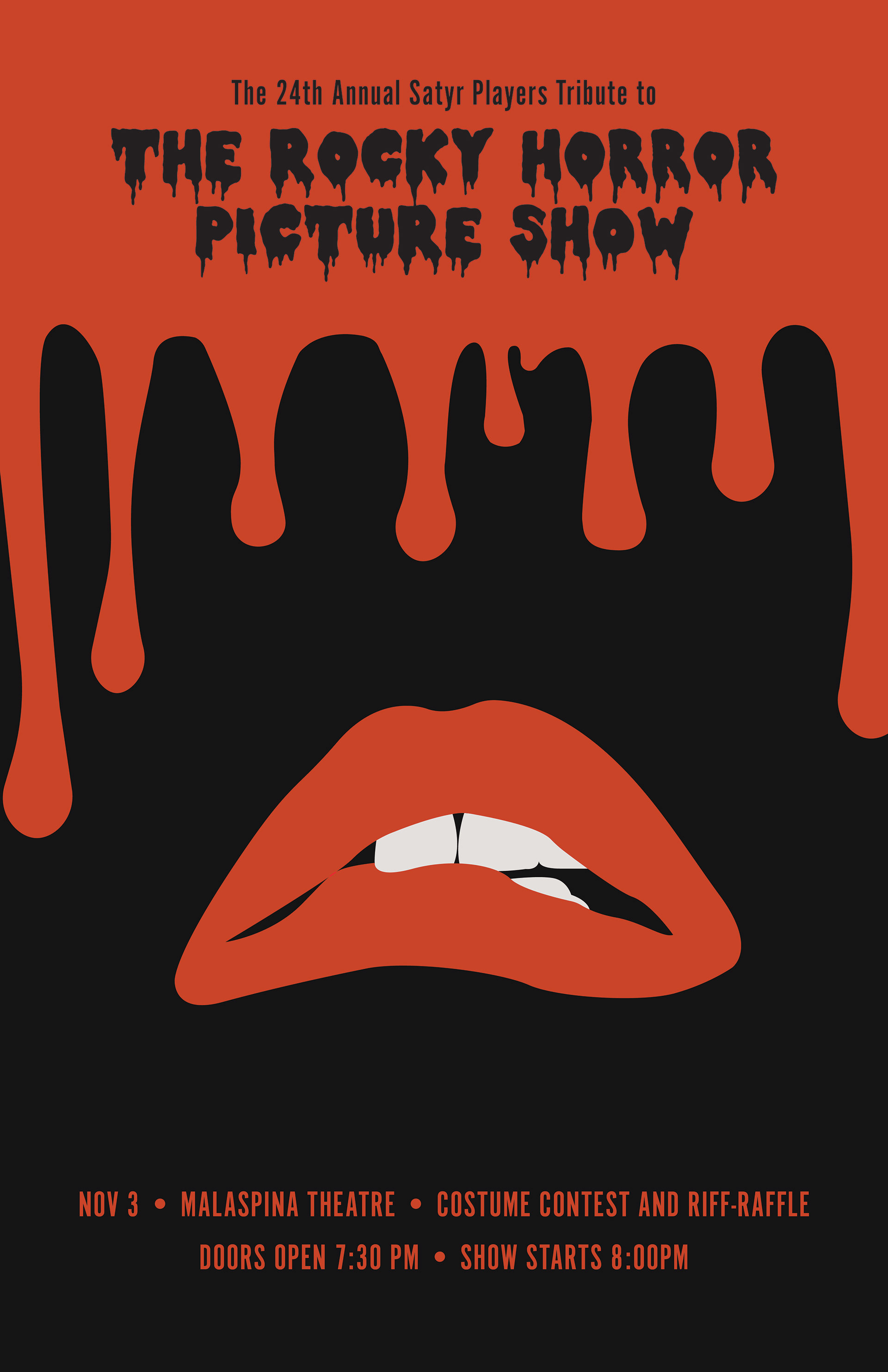
Rocky Horror Picture Show
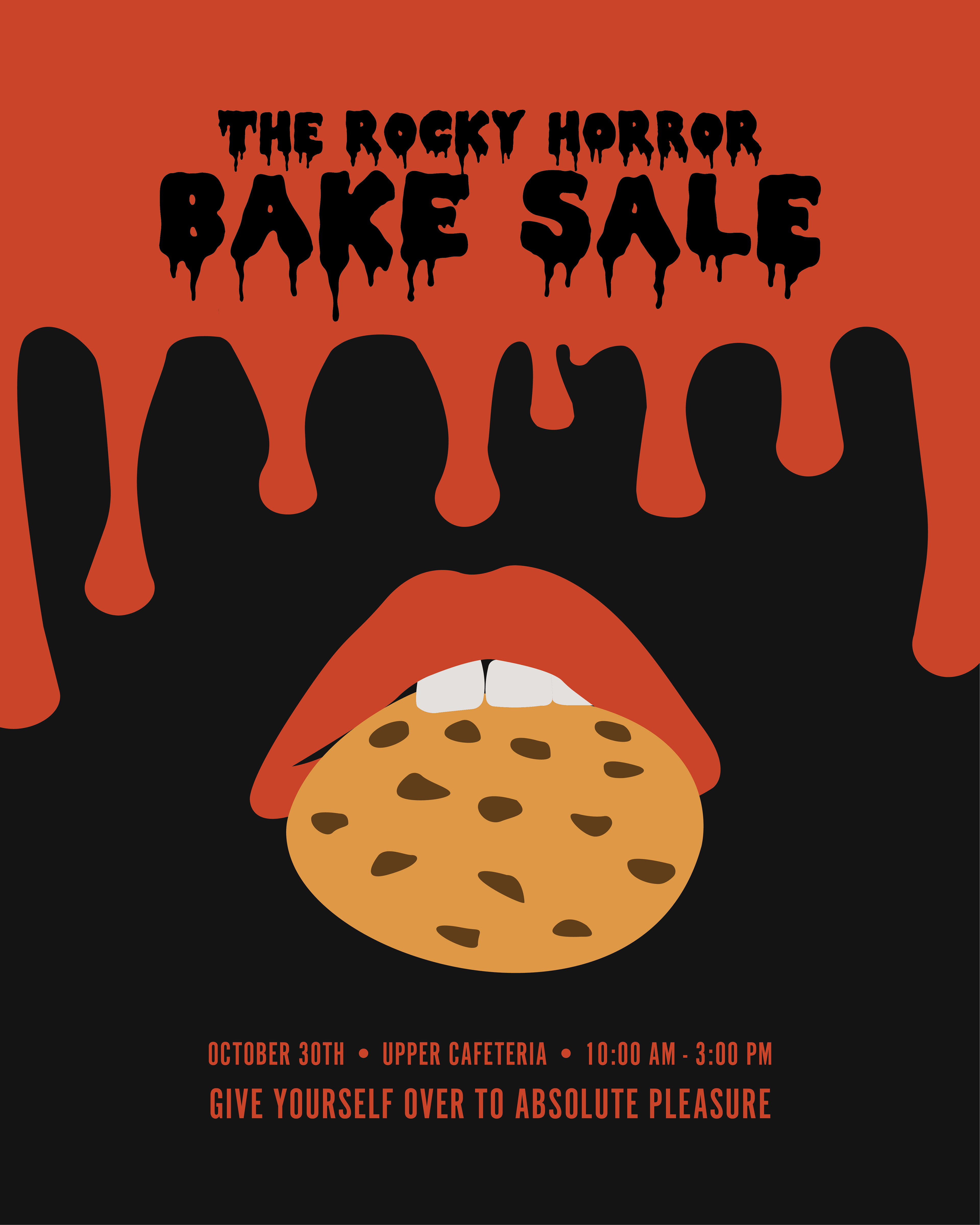
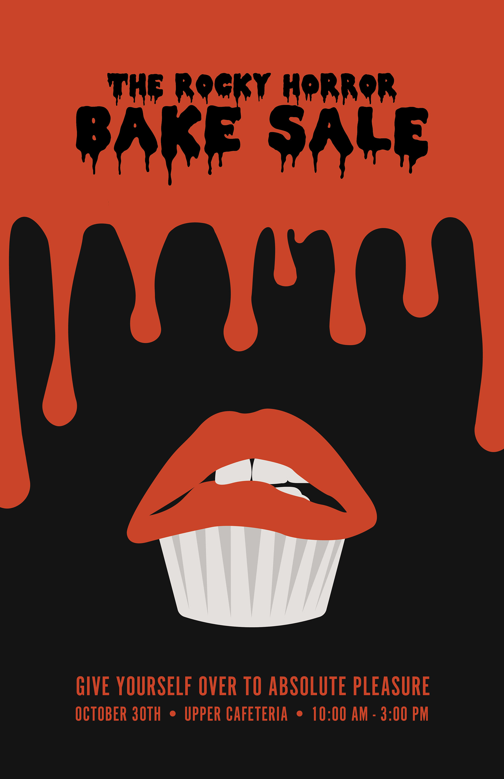
Looking through inspiration photos for this cult classic was an absolute pleasure. The iconic red lips and dripping blood font were a must. I set out to make something clean and straightforward, out of the dirty and hectic performance that is The Rocky Horror Picture Show. This set was made before the rebranding and new logo. I played around with different levels of texture and detail, before deciding to take a note from old playbills and let the iconography speak for itself.

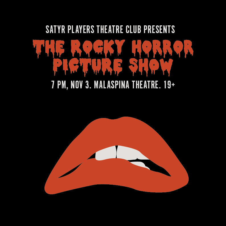
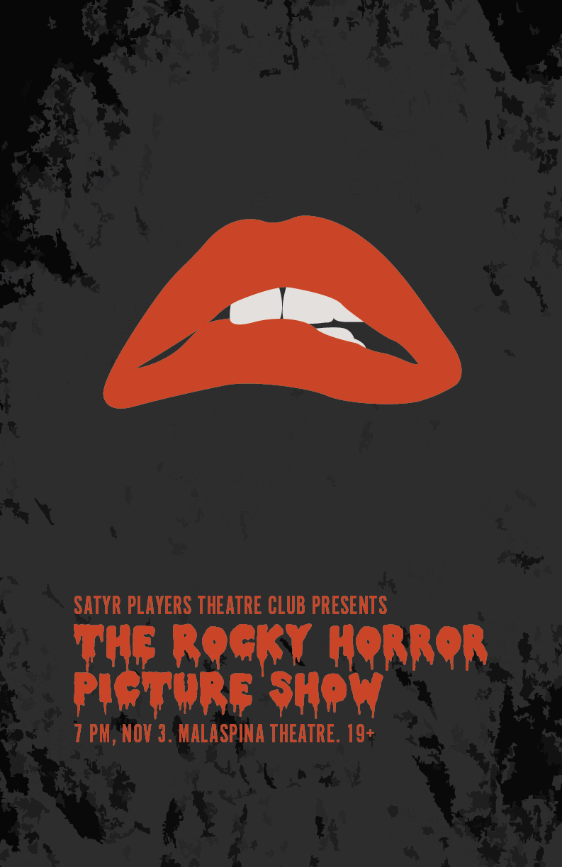
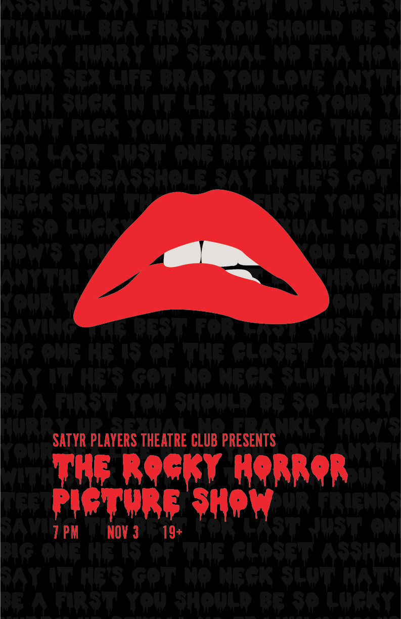

For this show, I created a poster and two square posts for social media. Based on this design, I made two alternatives versions featuring baked goods to advertise the upcoming themed bake sale, on social media and around campus.

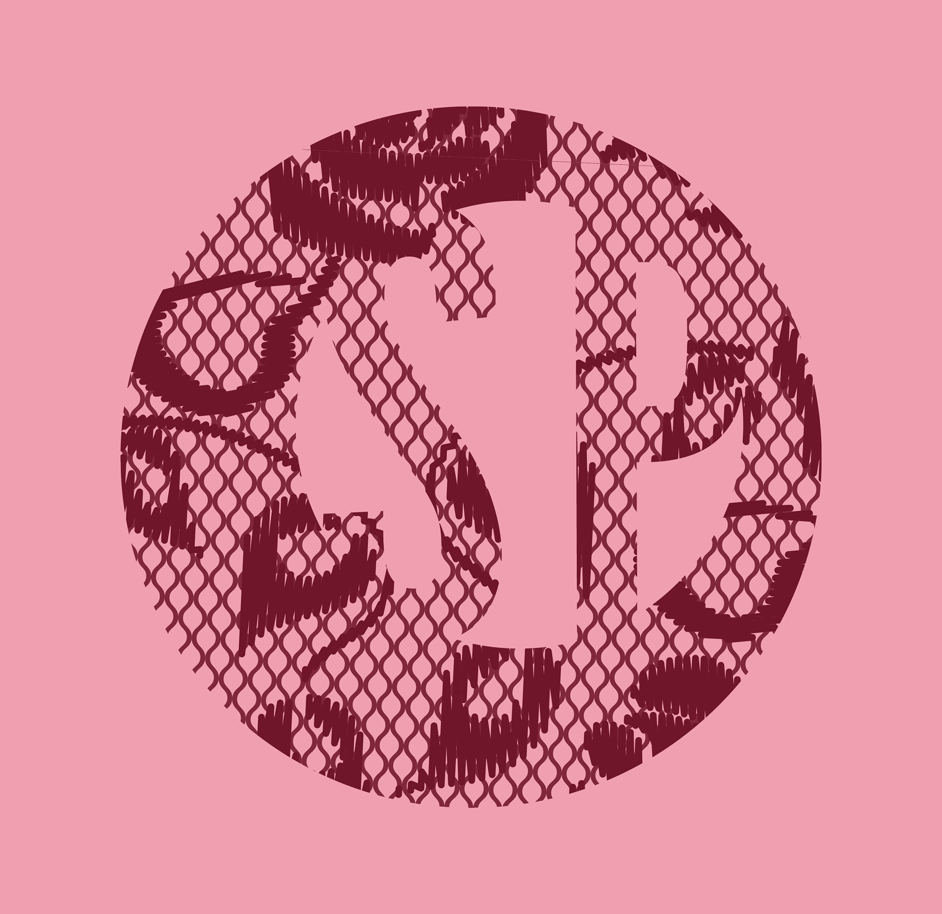
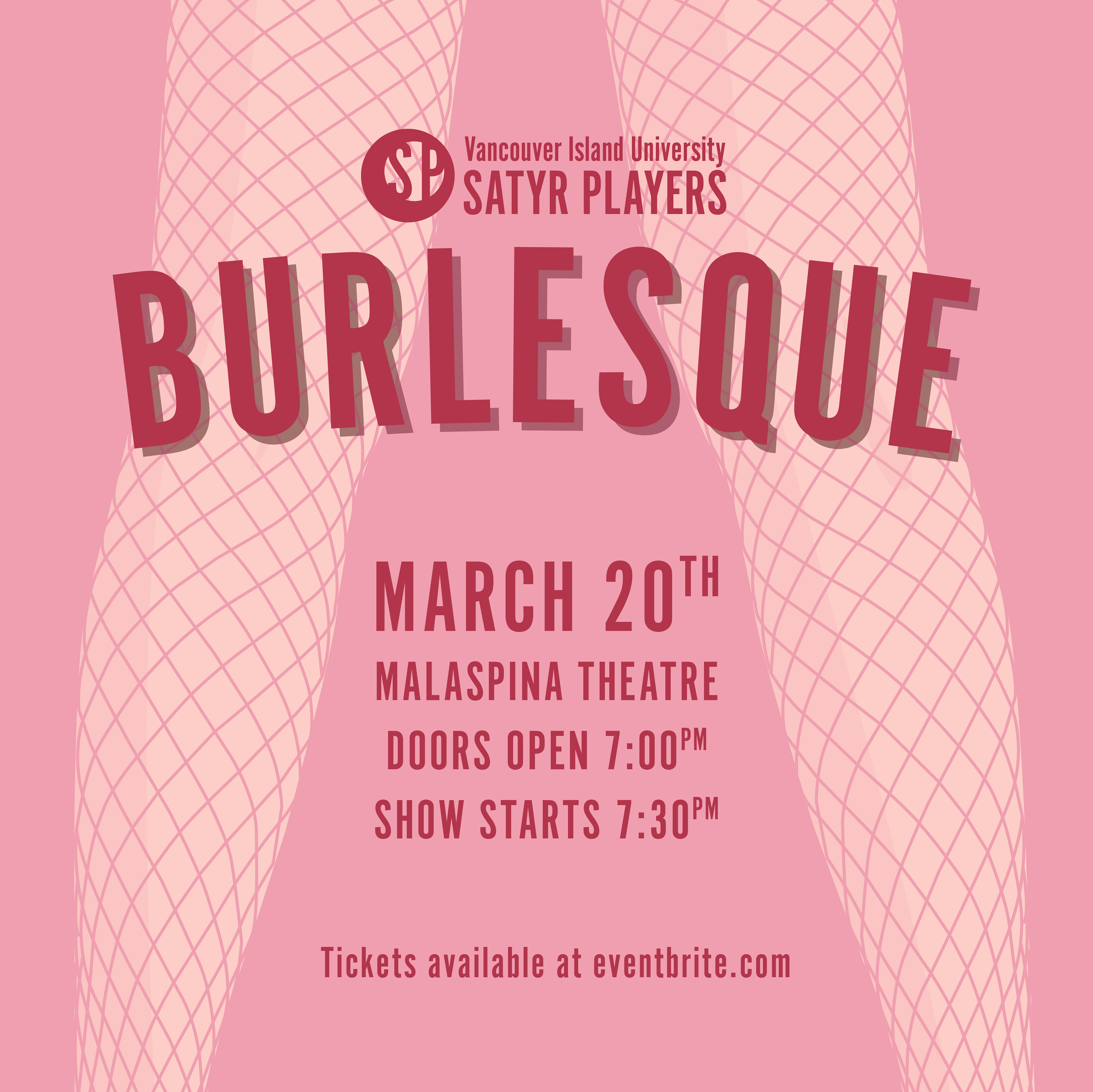
Burlesque
The most recent use of the rebrand is the annual Burlesque show. The theatre club changes their social media icon to reflect each upcoming presentation. I enlarged the lace vector so that it would still read when scaled down.
We wanted the colour palette to be unique from that of the Rocky Horror as the imagery is similar. I chose burgundy tones to represent the feminine and sultry mood of the show. The advertisements were used on social media and were also printed into flyers which were handed out at local bars leading up to the show. The bright legs shone in the black lights making for an even more eye catching design.